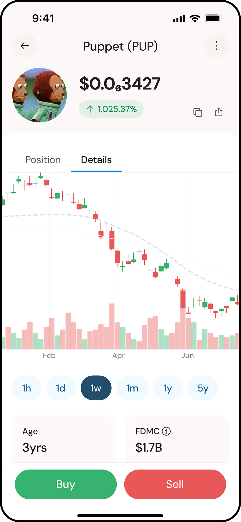
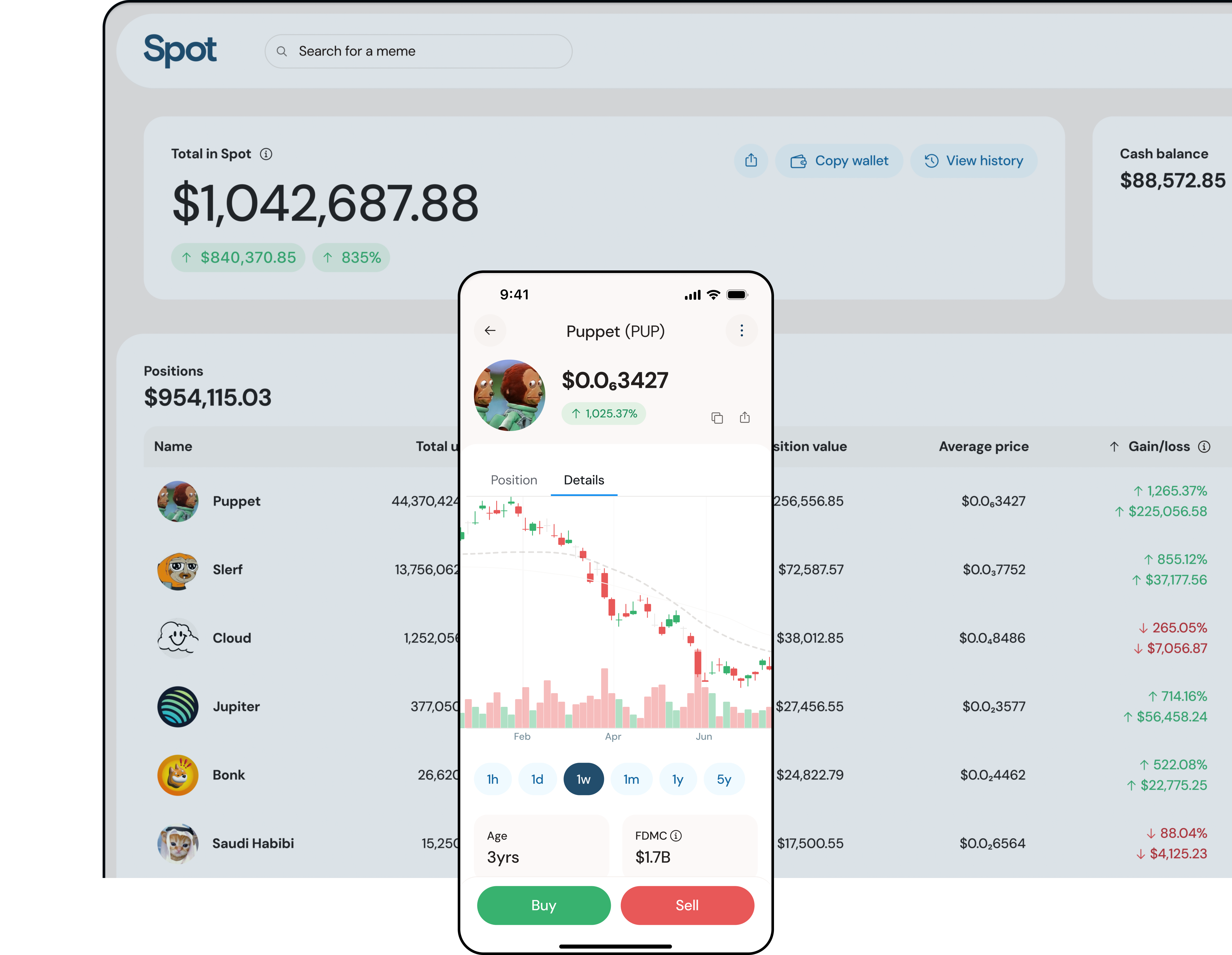
Designing a Simplified Crypto Trading Exchange Experience
Building a trading platform that simplifies onboarding and on/off ramp, enabling fast execution, clear position tracking, and confident portfolio management.
Mobile Product Design • Feature Strategy • UX/UI Design
Shipped iOS and desktop in weeks
Created the on/off ramp model
Context
Spot was a Bay Area startup building a crypto exchange during the peak of the meme coin surge. The goal was to make buying and trading meme tokens feel simple, direct, and trustworthy. Users could deposit dollars straight from their bank accounts and trade immediately, without intermediaries or hidden steps.
Problem
Most meme coin exchanges were difficult to trust and harder to use. They assumed deep crypto knowledge, buried fees, and fragile wallet flows. Spot needed to feel safe, obvious, and credible from the first interaction, while being designed and built from scratch on a one-month MVP timeline.
high cognitive load
wallet handoffs
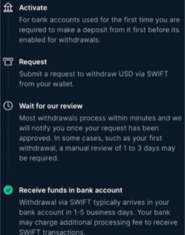
confusing withdrawal
unclear fees
Opportunity
This was an opportunity to rethink crypto trading for first-time users. By removing jargon, reducing steps, and designing for financial clarity, Spot could feel more like a modern consumer finance app than a speculative trading platform.
Approach
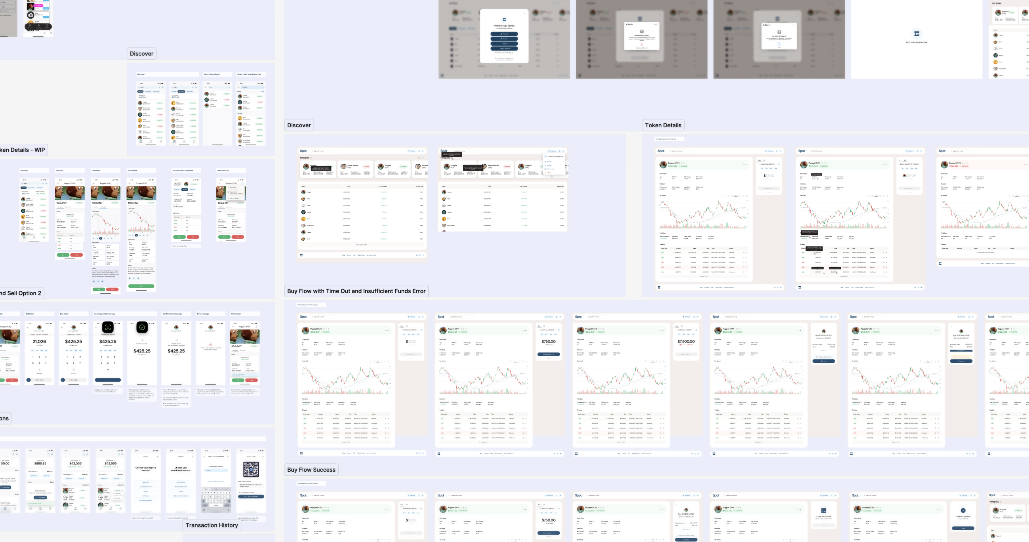
With an aggressive timeline, design and engineering moved in parallel. I audited existing exchanges to identify failure points, then designed the product one major section at a time. Engineering followed one week behind, building directly from finalized designs. iOS and desktop experiences were designed in parallel, with shared logic and platform-specific interaction patterns.
Week 1
Design -
Onboarding + Deposits
Week 2
Design -
Discovery + Trading
Build -
Onboarding
Week 3
Build -
Discovery + Trading
Solution
I designed the complete iOS and desktop web exchange experience, focusing on clarity, transparency, and ease of use across platforms.
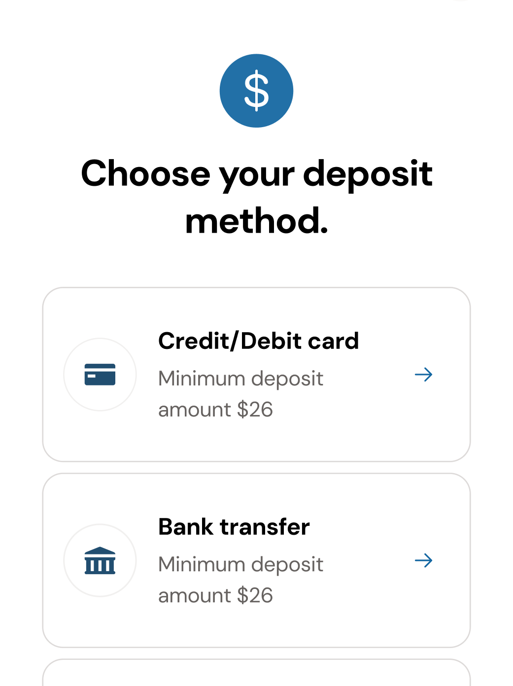
Onboarding and Deposits
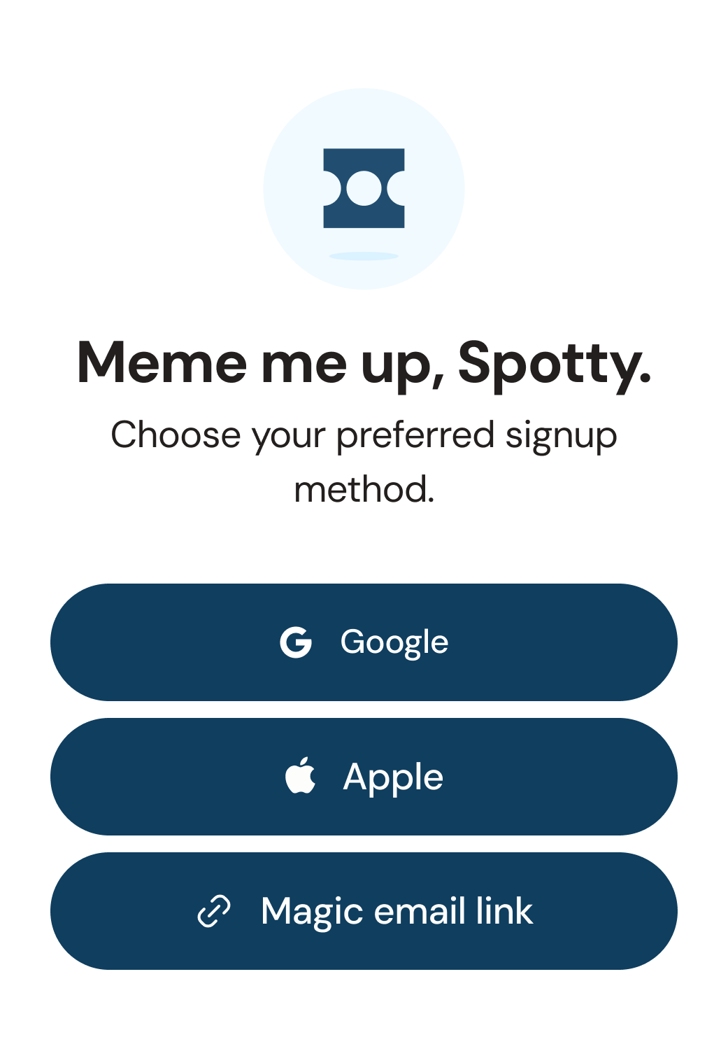
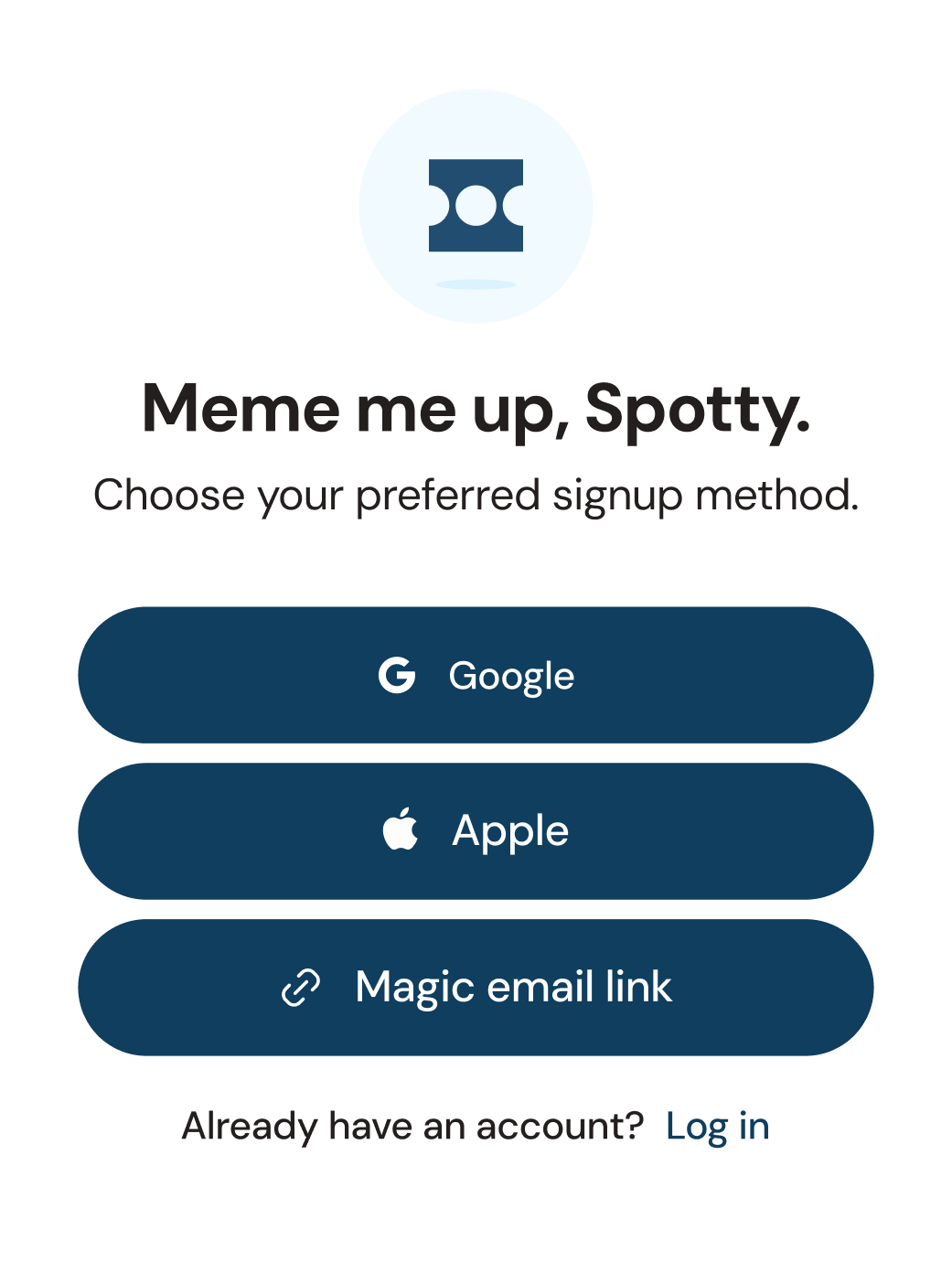
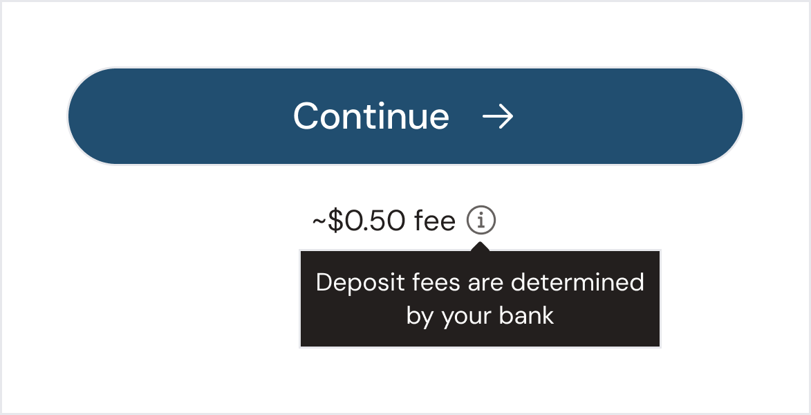
Onboarding was designed to feel calm and predictable. Users could connect a bank account, deposit funds, and understand what was happening at every step without needing prior crypto knowledge.
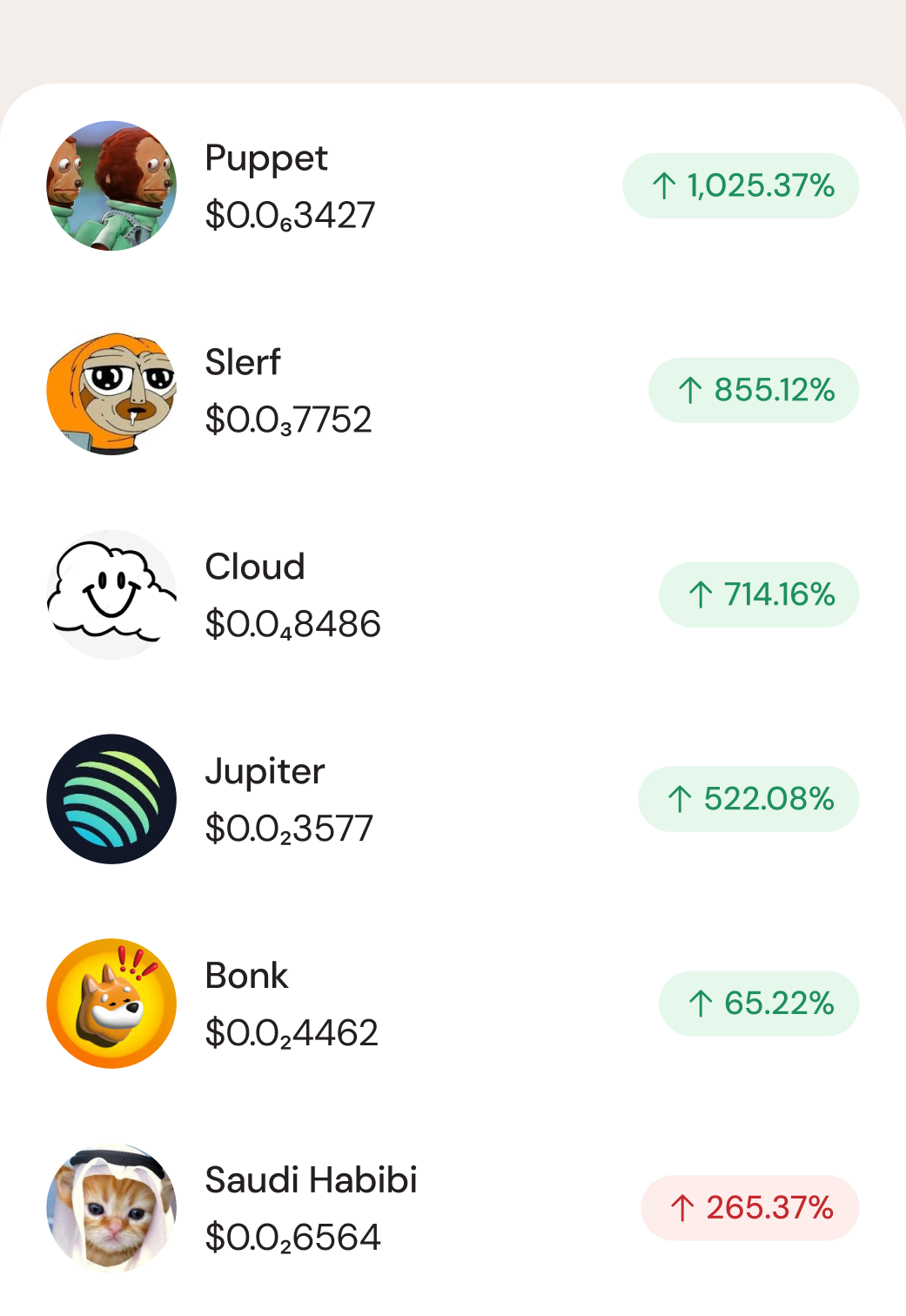
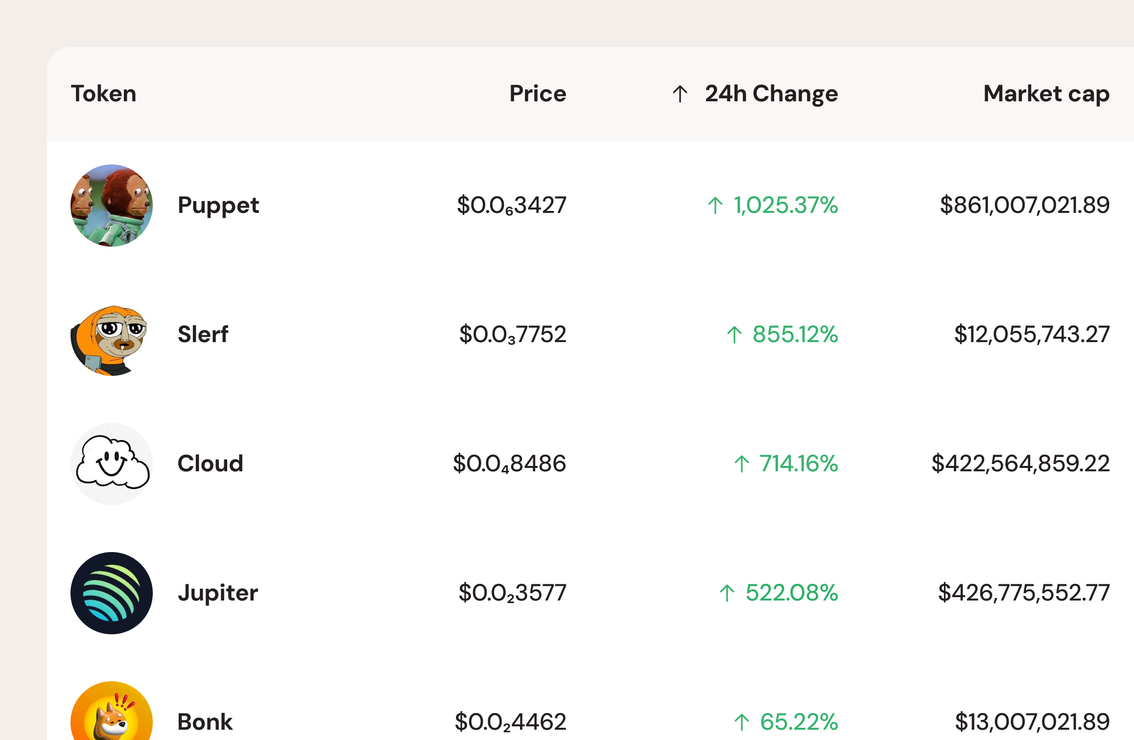
Token Discovery and Browsing
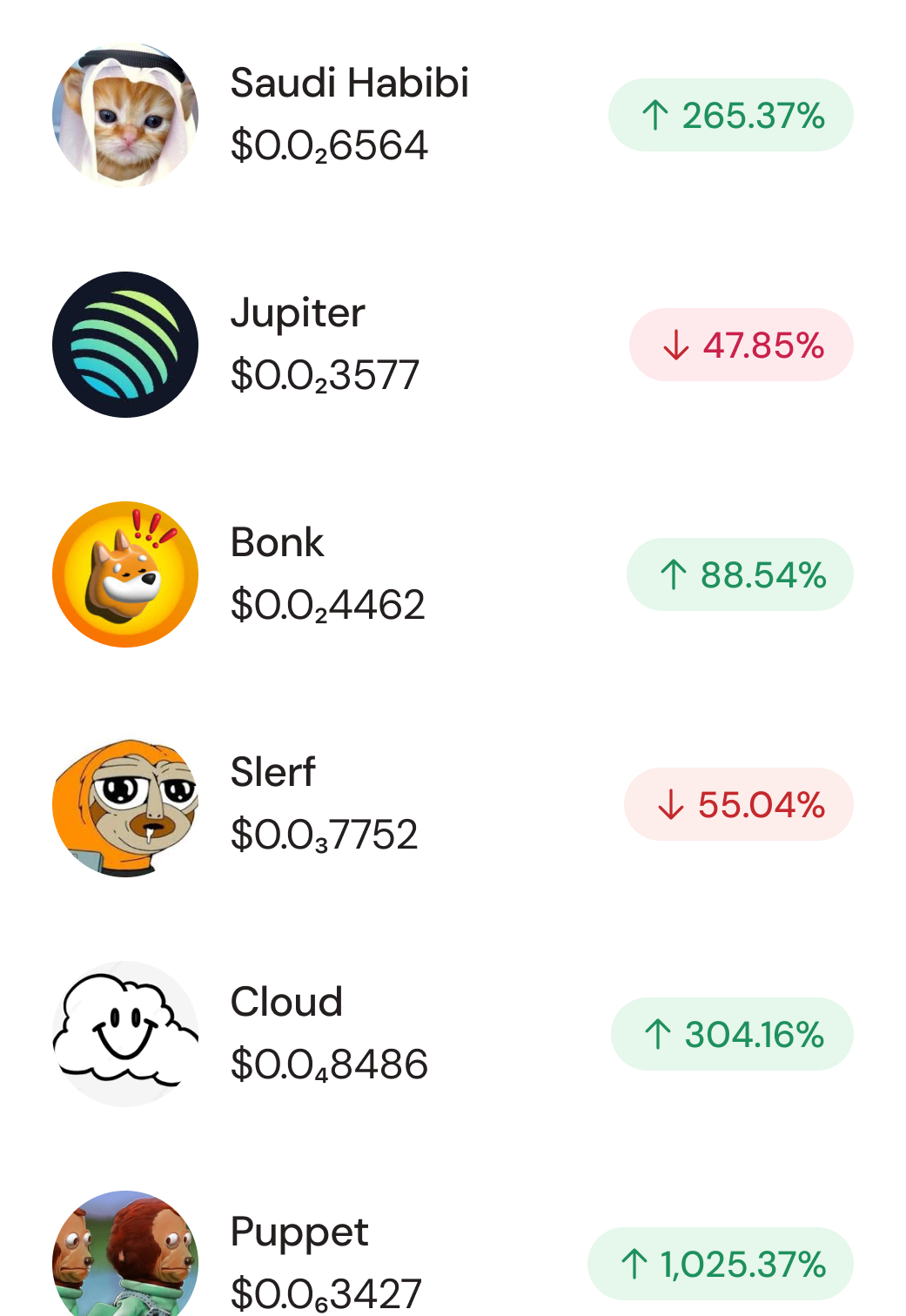
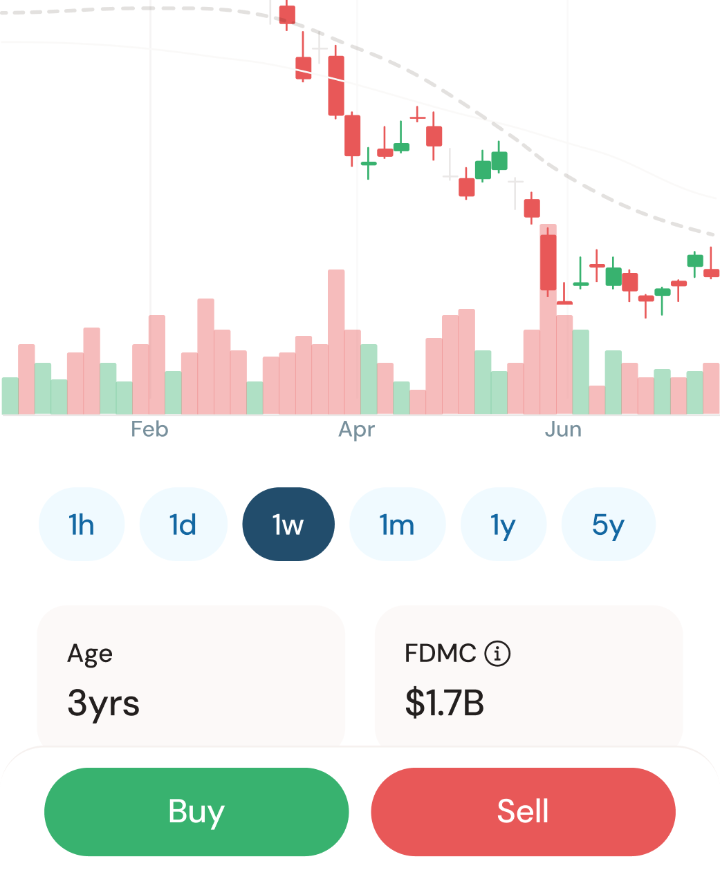
Token discovery emphasized clarity over hype. Prices, trends, and actions were easy to scan, helping users explore confidently without feeling overwhelmed.
Trading Flow
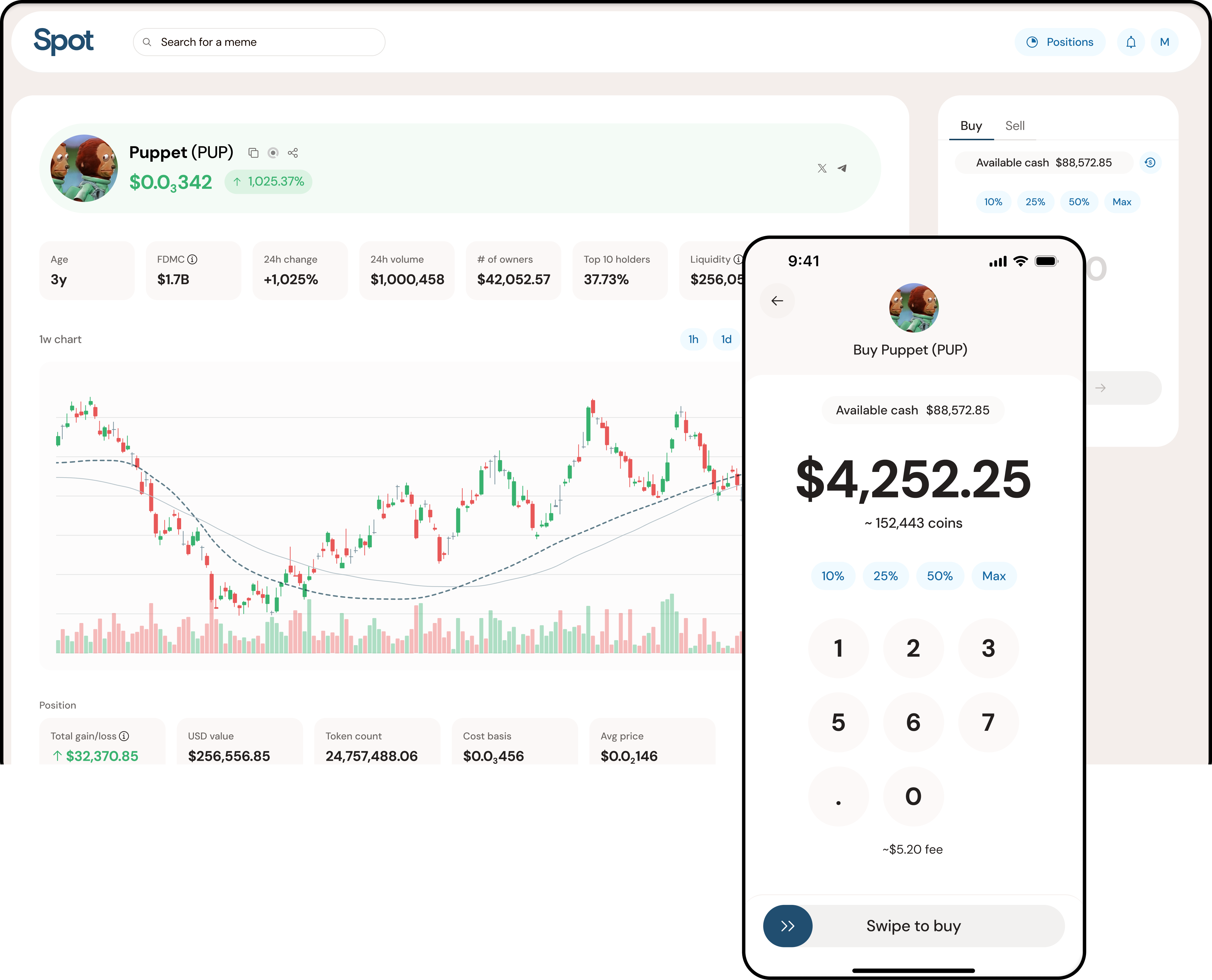
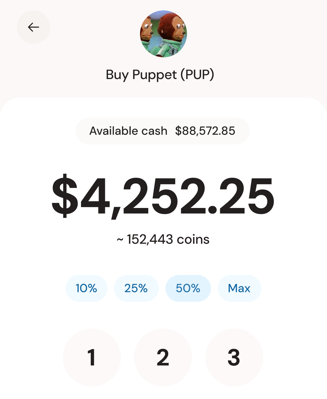
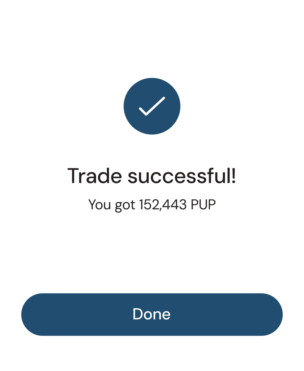
Trading interactions were designed to feel fast and reassuring. Every action confirmed intent, surfaced fees clearly, and provided immediate feedback.
Portfolio and Withdrawals
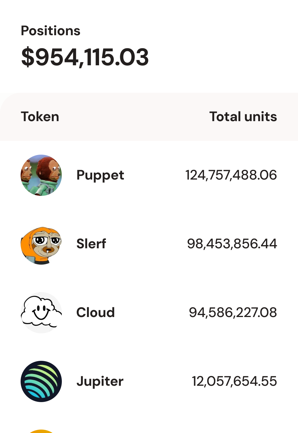
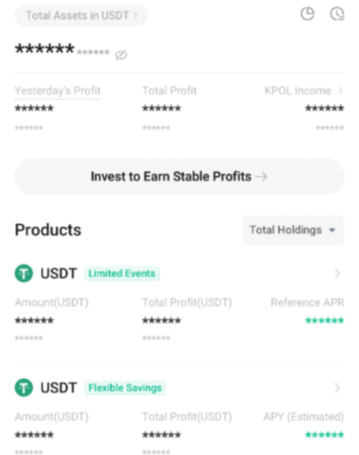
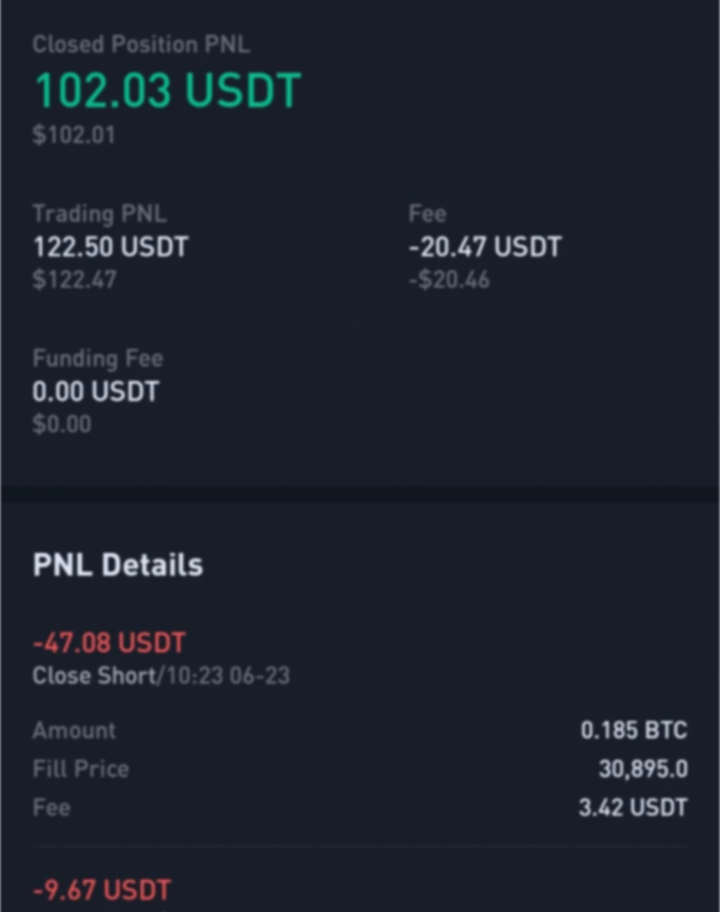
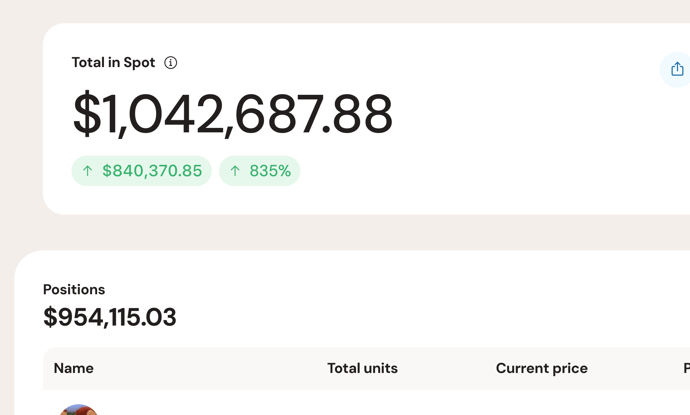
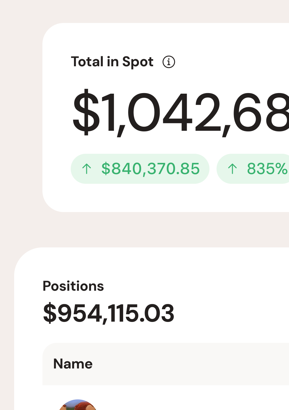
Portfolio management and withdrawals were treated as trust-critical moments. Balances, activity, and transfers were always visible and easy to verify.
Design start
MVP
Users trading
Impact
Spot launched its MVP on schedule, with users actively trading within weeks. The team moved from no product design to a functioning iOS and desktop exchange under extreme time constraints, validating the core experience in market.
Reflection
This project tested speed, focus, and adaptability. It required learning a new domain quickly and making confident decisions under pressure. While the company later wound down with the meme coin cycle, the work stands as a strong example of delivering a complete product system in a compressed timeframe.